We used inspiration from the slasher film 'Psyco' filmed in 1960, for our film poster. The iconic shower scene used close ups to add mystery and make it memorable.

Using this research we looked into what iconic items or shots we have in our teaser trailer that could become iconic for the advertisement of our film.

As shown above, we came up with many images which we could use for our film website and film poster. But we felt that the idea of using an eye to represent the victim of The killer confirms the common structure of slasher films. The eye represents vulnerablity as we were going to edit on tears to create the idea that the victim is scared and then we were going to edit on the map of whitechappel around the eye to show the historical reference to Jack The Ripper.The eye also displays vulnerability as it is made up of soft tissue which can easily be hurt which suggests how fragile the victims life is. As well as this, by using an eye, we are not giving away the identity of the victim showing that it could be anyone and adding to the mystery.
Initial ideas for the poster
Ideas of eye images:


Influences from other film posters with eyes
After having decided to use an image of an eye, we researched into existing film posters which also used eyes to see in what ways we could develop ours to make it more effective.Below are some of the posters we found:


These all show eyes with things either coming out to suggest that there is something inside trying to get out, or has a reflection of an image in the eye of what the person may be seeing or thinking of. We liked both of these ideas of taking the eye image one step further and therefore tried to incorporate these ideas into the development of our own poster.
Developing one of our first initial idea

Image ideas for the Camden Map

 These images are a map of camden and are displayed with the old fashioned aspect as they are black and white. We chose these images as they are black and white and fit in with our trailer well.
We then added the map above on the left of Camden and overlapped it onto our eye image. This is what it looked like;

But due to audience feedback we decided to change the poster idea as the map concept was not as effective as we had previously thought as it hinted that the film would be a psychological horror rather than our chosen slasher genre. We continued to develop this initial idea and chose to keep the eye as it represents vulnerability, but decided to overlap the image with that would demonstrate our genre.
Taking this into consideration we tried adding an image of the shadow of the killer onto the eye. This would therefore show the knife from the victims point of view and show how scared they are by looking them in the eye putting the viewer in the perspective of both the victim and the killer.This combination of images would also cause tension as the viewer doesn't know what would happen to the victim. We had used shadows within our trailer to represent the killer, as within the trailer we didn't want to show the killer's face, and by using shadows it makes him seem dark and mysterious to the audience. This was one of the most effective and striking shadows we found in our trailer which we thought would be most suitable for our poster.

We then combined the image of an eye ad the shadow of the killer together using the visual overlay that we had created using Imovie. This shows the process of making this initial poster image idea.

We then took this image and uploaded it to word document to start our first initial idea.We cropped the image so that the head of the killer was not shown so that the viewer would see less of the killer and edited the image using Iphoto to change the contrast making the shadow look more dramatic. Below is the edited image we used.


We found that this image of an eye was more suitable than the eye with the map as it is zoomed out slightly so that there is space for the shadow. There is also less detail than the earlier image showing the anonymity of the victim. It is also more effective as the pupil of the victim is looking up suggesting that that they are looking up to the killer. This shows that they are smaller and therefore defenseless creating empathy from the viewer. We believe that the positioning of the shadow is also effective as it is placed so that the sharp knife is piercing directly into the eyeball showing both pain and fear.
Initial idea two
We wanted to create a variety of initial ideas so that so we had a choice and could get audience feedback to see which one they preferred. We then went on to create a second different idea.We again wanted to use a combination of two images we had used in our trailer to show a consistent link. After looking at different images from our trailer we decided to use these images.


We then used the online program 'Fotoflexer' to edit the photos together to cut the background on the image of the back of the killer and then overlapped this onto the image of the victim running away, changing the opacity to make it less obvious. This was the resulting image that we created.

We choose to create a combination of these images as it shows that there will be a female victim, however it is made blurry so that it would not give away to much detail on the individual. She is also running away in a dark tunnel to create fear and mystery for the audience, whilst the shadow adds to making the image look more dramatic. We added the photo of the back of the killer to give the sensation that he is watching and following the victim to suggest that something bad will happen, again reinforcing our horror genre. We played with this image by changing the colour to make it stand out more using the colours purple and red to give connotation of darkness and blood.


However we felt that these were too bright and did not fit in well with the black and white lighting we had used in the trailer so we therefore decided to keep the black and white image.
Initial idea three
For our third initial idea we chose two other images from our trailer and again overlap to create an effective image.Having looked at different camera shot we decided to combine these images:


Again by using 'Fotoflexer' we layered these images together and edited the decrease the opacity to make them blend better together and increase the contrast to make the shadow stand out more and emphasise darkness and mystery. This was the image we created from this combination:

We chose these images as it shows a medium shot of the female victim looking scared showing her vulnerability suggesting that she will be hurt which creates fear. This vulnerability is contrasted with the image of the knife hanging down near her face implying that there will be danger.
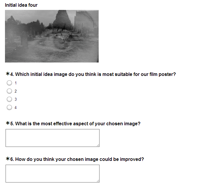
Initial idea four
For our last initial idea, we used an image from an overlay made from our Imovie. This is the image we chose:

We thought this image would be suitable for the poster as again the use of the eye shows vulnerability and the notion of an unknown victim, connoting mystery and horror. This is effectively contrasted this image with a long shot of a graveyard which represents death which shows that the film will include murder and pain. By using this image on the eye it makes it look like the victim is looking at and foretelling her own death which amplifies the idea of horror and gore.
Audience feedback on the Initial ideas
Having made up these four initial ideas, we then wanted to get audience feedback to help us decide which was the best image to use for our poster. To do this we created a short clear questionnaire using the online program 'Surveymonkey' with the following 6 questions:


We decided to ask if they were male or female to see who our trailer would appeal to and asked their age within the range of 18-25 year olds as this was our chosen target audience age group. We then showed images of all ideas and asked which one they preferred and asked what was most effective and how this could be improved.We then emailed this survey to people we knew within the age range. These were our results:
Question one:

We found that the majority of our audience was male, suggesting that our trailer, genre and plot may appeal more to men.
Question two:

We found that the majority of the feedback from our audience came from 21 year olds.

We made sure that all the people we emailed had seen the first draft of our trailer so that they had a general understanding of our plot and genre so that they could then decide which image for our poster would be best suited to the trailer.
Question four:
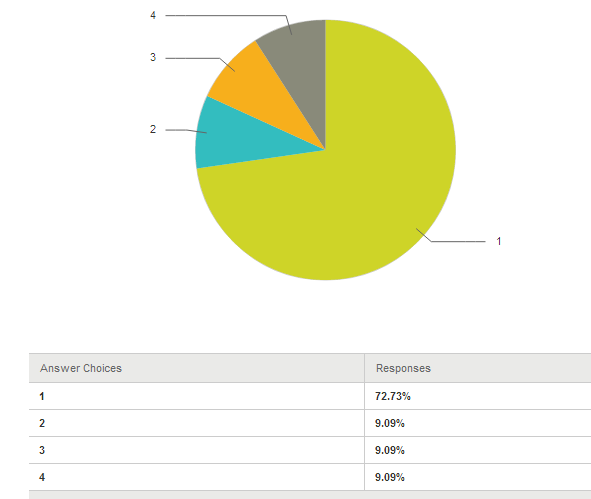
This was our most important question in our survey so we could know which image would appeal more to our audience to use for our poster. The findings displayed show that our first initial idea of the eye and the knife was most popular, so we decided to use this for our final design.
Question five:

These results show what the audience thought was the most effective part of the image. The comments show that they believe that the most effective part was the use of the eye and the use of the shadow of the knife so we made sure to keep these aspects in our final poster image.
Question six:

These are some of the comments we received on how to improve our initial idea.The most popular comments said that we should make parts lighter and increase the contrast as well as possibly trying to use colour. We took all of these useful comments into consideration whilst developing our poster.
Using this audience feedback, we then made some parts lighter and increasing the contrast to make the shadow to make it more dramatic using Iphoto. This is the edited photo we created ater editing.

No comments:
Post a Comment