Our trailer, poster and website 'The Ripper's Shadow' all conform to many different conventions of other media products in the horror genre. However, we also decided to subvert some of these codes in order to give our media product a unique twist. We begun our coursework by investigating the codes and conventions of our chosen genre of horror, to see which conventions we could confirm or contrast too.
Trailer
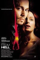
Having researched existing horror film trailers such as 'from hell' and deconstructing them, we found that we wanted to use similar aspects to make our trailer more effective.
Our trailer deconstruction can be found on the previous blog link
Trailer
Having researched existing horror film trailers such as 'from hell' and deconstructing them, we found that we wanted to use similar aspects to make our trailer more effective.
Our trailer deconstruction can be found on the previous blog link

Similar to the content of these trailers, we used short snippets of shots by taking a scene and using Imovie to cut it into smaller shots and spreading them out to intertwine them. We also made sure that the shots nearer the beginning were longer such as the shots of Camden and changed the duration of the following shots to increase speed and create the fast paced effect that was found common in other trailers. This was effective as the increased speed builds up tension for the audience as well as fear for what will happen which relates well with our horror genre.

The use of the isolated locations in our trailer are stereotypical for this genre, for example the shots of our victim running through tunnels in Shad Thames as well as the dark empty streets of Shad Thames and the panning shot of the graveyard.These were important as they created an atmosphere of alienation for the victim so that the audience empathize that they are alone.


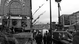
However, we contrasted these with scenes with a busy atmosphere for example the long shot we have of busy Camden with a crowd of people.We decided to include this shot as, in comparison to the isolated scenes, they show that the victim could be among all these people and that whilst someone is being killed, other people are unaware and continue on with their daily lives, unable to help. By using the visual overlay of the killer sharpening saws, it implies that no-one is safe and that the killer is going to pick a victim from Camden, suggesting the plot of the film.


The use of the isolated locations in our trailer are stereotypical for this genre, for example the shots of our victim running through tunnels in Shad Thames as well as the dark empty streets of Shad Thames and the panning shot of the graveyard.These were important as they created an atmosphere of alienation for the victim so that the audience empathize that they are alone.


However, we contrasted these with scenes with a busy atmosphere for example the long shot we have of busy Camden with a crowd of people.We decided to include this shot as, in comparison to the isolated scenes, they show that the victim could be among all these people and that whilst someone is being killed, other people are unaware and continue on with their daily lives, unable to help. By using the visual overlay of the killer sharpening saws, it implies that no-one is safe and that the killer is going to pick a victim from Camden, suggesting the plot of the film.


Another similarity that we included was the use of young characters as it is clear that our victim is in her late teens (see characters label on blog). The use of this age group is more compelling as young characters give connotations of vulnerability, innocence and makes the viewer feel protective over them as they are unable to defend themselves.
In addition, to take this concept further we also made sure that our victims were females as stereo typically women show weakness and vulnerability which again creates fear among the audience. This supports Vladimir Propps' theory that women play the victims in traditional media texts and are usually found to be victims of brutal murders. As well as this, we also looked into Laura Mulvey's 'Male gaze' theory, which we put into a blog post which suggests that film audiences have to view the character from a heterosexual males perspective therefore the use of female victims were ideal as our target audience were males.We tried to include this theory into our own trailer by filming from behind our female victim so that the viewer can see from the male killers view so that the audience could the shortness of her costume as well as her vulnerability.

Lastly, the use of our female victim, also conforms to Clover's 'Final Girl' theory, which is commonly found in horror films and suggests that there should always be one girl alive to confront the killer and possibly the only on left to tell the story. She also states that whilst at the beginning the viewer shares the perspective of the killer, by halfway through they shift and identify from the girls viewpoint. We incorporated this theory into our trailer as at the beginning we concentrate on the killer by using a voice over of him speaking about his influences and and showing shots of already dead victims for example the medium shot of the female victim lying on the ground with a slit throat.

However, halfway through we then change focus of shots to an alive female victim such as that of her running away and in her house, and by using the title 'the one that got away' it suggests that the plot is mostly based on her and whether she will survive. An example of a trailer which successfully uses a female victim is 'Psycho' released in 1960 when women were seen as inferior. The vulnerability of the character is increased by placing her killing in the shower where she is exposed. Taking inspiration from this we decided that we wanted to film some scenes in our victim's house as it takes away the safeness of her own environment. This is shown in our scenes of the victim in her room, looking out the window, pulling down the blinds out of fear of seeing something and suddenly whips her head round implying that someone unwanted is there. The use of this setting and the zoom in onto a close up of her face looking scared shows that the killer has invaded her territory and that nothing can stop him from getting her, again connoting her weakness in the situation.
Our response from our film:


 |
| Young Characters from other horror films (Cabin in the woods) |
 |
| Young character from our film |
In addition, to take this concept further we also made sure that our victims were females as stereo typically women show weakness and vulnerability which again creates fear among the audience. This supports Vladimir Propps' theory that women play the victims in traditional media texts and are usually found to be victims of brutal murders. As well as this, we also looked into Laura Mulvey's 'Male gaze' theory, which we put into a blog post which suggests that film audiences have to view the character from a heterosexual males perspective therefore the use of female victims were ideal as our target audience were males.We tried to include this theory into our own trailer by filming from behind our female victim so that the viewer can see from the male killers view so that the audience could the shortness of her costume as well as her vulnerability.

Lastly, the use of our female victim, also conforms to Clover's 'Final Girl' theory, which is commonly found in horror films and suggests that there should always be one girl alive to confront the killer and possibly the only on left to tell the story. She also states that whilst at the beginning the viewer shares the perspective of the killer, by halfway through they shift and identify from the girls viewpoint. We incorporated this theory into our trailer as at the beginning we concentrate on the killer by using a voice over of him speaking about his influences and and showing shots of already dead victims for example the medium shot of the female victim lying on the ground with a slit throat.
However, halfway through we then change focus of shots to an alive female victim such as that of her running away and in her house, and by using the title 'the one that got away' it suggests that the plot is mostly based on her and whether she will survive. An example of a trailer which successfully uses a female victim is 'Psycho' released in 1960 when women were seen as inferior. The vulnerability of the character is increased by placing her killing in the shower where she is exposed. Taking inspiration from this we decided that we wanted to film some scenes in our victim's house as it takes away the safeness of her own environment. This is shown in our scenes of the victim in her room, looking out the window, pulling down the blinds out of fear of seeing something and suddenly whips her head round implying that someone unwanted is there. The use of this setting and the zoom in onto a close up of her face looking scared shows that the killer has invaded her territory and that nothing can stop him from getting her, again connoting her weakness in the situation.


One code which we subverted was the use of a sub plot of a male and female relationship which is popular in many genres of film including horror. These are often included as viewers enjoy seeing romance and worry that something will happen to get in between them, however we decided not to include this as we did not want to take away focus from the main plot which was that our female is in a fight against the killer and that she is alone and has no-one (such as a male) to protect her.
Another code which we do not feel that we effectively showed was Levi Strauss's 'Binary Opposition' theory which suggests that a film narrative moves from one point to another by establishing potential conflict. It also implies that we as the audience understand meaning through the relationship between things and that films should have elements that oppose each other to keep the viewer engaged. For example in the 'From Hell' trailer, this binary opposition is shown as there is a killer and 'the hero' who is the detective as he stops the killer and attempts to save the others, showing both sides of a fight. This is something that we wanted to have in our trailer, as in our initial storyboard we had planned shots of a close up a police man opening up a package from our killer with a liver in to show that there would be elements of a chase within the film. However, due to disorganization in planning, we were unable to find a suitable location and actor to make the scene look realistic therefore instead we have close up shots throughout our trailer of the killer placing the liver in a package to send off to imply that someone will get it and try and stop him. The reason for needing a shot with a package, is written in this blog post.


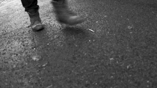
Another theory which we used in our trailer is Roland Barthes' enigma code, that is mentioned in our narrative theory blog post. This suggests that media products pose questions and creates mystery in order to draw in an audience as they start to think of their own answers to questions. We portrayed this in our trailer as we used semiotics to create enigmas for the viewer, For example the main question created, is 'who is the killer?'. At the start of the trailer we set up this enigma by having a voice over of the killer speaking over a montage, so that we know that he is a man, where he is attacking and that he influenced by Jack the Ripper, However his identity is kept hidden throughout as there are no shots used of his face. Instead, we use shots of other parts of his body such as his feet in the shots of him walking towards the camera, as well as his arm in the shot of him slashing down the knife, and lastly his hands in the medium shots of him wrapping up the package and picking up the weapons. All these scenes give clues to the audience such as that he may be middle aged as his hands have slight wrinkles.


As well as this, we also film some parts such as the tracking shots in the killer's perspective so that the viewer can identify with him. These shots keep the audience wondering throughout who it may be as it creates a sense of mystery. Another question suggested is 'Will the girl who got away survive?' this is one of the questions which will appeal to the audience to see the film as they want to see what will happen to 'the final girl', as there are scenes of her running away throughout, however the final scenario of what happens to her is not given away. The viewer wants to know what happens to her as they have seen shots of other dead victims and a graveyard which creates fear for what will happen and she is made to look vulnerable. The enigma 'Why is the killer killing these girls?' is also created, as although the voice over implies that he is influenced by Jack the ripper, the trailer does not go in more depth to explain why he is killing his victims which would be found out in the rest of the film.

When filming and editing our trailer we made sure that we included a variety of conventional camera angles which we had found in other horror trailers. The use of close ups were significant as they show more important parts for example the close up shot of the victims eye shows the panic they feel as well as looking from the killers perspective. By overlaying the eye with the panning shot of the graveyard, it is effective as they contrast each other as the eyes are supposed to represent 'the window to the soul' whereas the graveyard shows soulless bodies which gives insight into what will happen to the victim.

We also use establishing shots, to set the location, for example the long shots we filmed of Camden. This reinforces that our killer is set in Camden rather than Whitechapel where the original Jack the Ripper killings took place. We chose to set our killings in Camden as in this era, Camden is the new urban, busy place and is central whereas in the past Whitechapel was the focal location. These shots therefore set scene for the plot of the film.


Another sound effect which we could have used was 'screaming' as these are conventional sounds found in other horror trailers. However, we chose to subvert this convention to use this sound as we did not feel that we could create or find a realistic scream which reflected the victims pain and we felt that it made the scene seem fake.
 We also used a non-diegetic piece of music for the entire trailer. We found this music on Youtube and edited it using the software Garageband to make it fit better to our trailer. After researching into sound pieces in other horror trailers we decided to use a music that starts off slow and quite quiet and as the trailer continues it gets slightly faster and has beats added in the background making it slightly louder, this causes it to build up tension, keeping the audience interested similar to these trailers.One code which we found uncommon in horror trailers was the use of a voice over. However, in our trailer we decided to challenge this and use a voice over of the killer speaking to Jack the Ripper and how he has influenced him which we wanted to use as it sets up the plot so the audience can make connections with Jack the Ripper and have a vague understanding of the story line. In addition, it also allowed us to explain the location anomaly of our trailer being set in Camden rather than the original location of Jack the Ripper in Whitechapel, this clears up any misunderstanding as in the voice over he says "Whitechapel was your hunting ground, Camden is mine" and "I need to keep moving".
Our voice over blog can be found on the blog link http://therippersshadow.blogspot.co.uk/2013/01/voiceover.html
We were pleased with the sound throughout as in our feedback from our focus group many said that the music used was effective, however we had some technical difficulties as although we had muted, detached and deleted the sound audio from some of the clips, so that the diegetic sound from us filming was not used, when we burned the trailer it was still present. This was unusual and we could not do anymore to change it, luckily the sounds are not too noticeable and therefore these clips can be kept. This was evident in the shaky shots of Shad Thames.See our problems and solutions blog to see how this was resolved.
Unlike most modern films, we chose to film and edit in black and white. This was effective as it emphasized the use of shadow, for example the dark scenes of streets in Shad Thames.In preparation for this we had to experiment with shadow by using a white wall and flashing a light in the dark to create effective shadows. It was also useful as we did not need to worry that the colour of our fake blood looked unrealistic and therefore made the gore look more successful. This challenges some of the deconstructions we did of modern horrors, such as 'From Hell' however supports other trailers such as psycho.
 The Mise-en-scene of our trailer was also very significant as we needed it to reflect the horror genre. When looking at existing trailers we found that one common convention was the use of low key lighting to create fear through darkness, which then encouraged us to use similar lighting in our work. We edited in Black and White so our trailer already had a large amount of darkness however we decided to enhance this in several ways. We firstly made sure to film some parts in the evening so that it was dark including the shots of the dark tunnels and the shaky tracking shots of the Shad Thames streets. This was essential as by filming it in the evening, the lights in the tunnel and streetlights were on which created a good contrast between dark and light which was done naturally rather than through editing and therefore looked more realistic. In addition, the lights casted shadows which created shapes and looked effective. We really liked the use of these shadow as they represented the idea that things were hiding in the dark such as the identity of our killer.


We also had to make sure that the costume used throughout our work represented our characters successfully. As the majority of our main killer is covered up as we wanted to mask his identity the only parts of him showing are his shoes and his lower arms and hands. We decided to use biker boots and builders shoes which were black as they showed masculinity and were bulky to imply that the killer is strong. When the killers arms are showing in the scenes when he is feeling the saw, we made sure that our actor was wearing a long sleeve black jacket as again the colour black conotates evil and suggests that the character is dark.


Our first female victim who is lying dead in our trailer is wearing a white top as this colour connotates goodness and suggests that she was innocent which makes the viewer feel that she did not deserve to die and empathize with her. In contrast, our 'final girl' female victim is wearing dark clothing and wears a short skirt with a long coat, black tights and some heeled shows. We decided that we wanted her to wear this as we wanted to oppose the part of the 'final girl' theory which states that the female victim is innocent and 'virgin' like.Instead we wanted to show that she may not be so innocent as the shortness of her skirt and heeled shoes show promiscuity and to show that she may have done something which has made the killer want to kill her which would then be found out in the film.


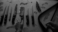
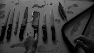
In order to follow the conventions of a slasher horror film we had to use props which suggest that there will be gore which included sharp weapons such as saws and knives. We used a medium shot of of a table full of these weapons with the killer picking them up and feeling the edge of them to test the sharpness to portray that he is about to do a killing and create the sense of fear. Again to show gore we used a liver which we purchased from a butchers and used a close up shot of it to imply that it came from the mutilated body of a victim and use a note attached to it saying 'from hell' and put in a package to be sent off to the police. This was a reference to Jack the Ripper as like our killer,he also sent body parts of his victims to the police to mock them. Additionally we showed the idea of slaughter by using makeup to create a slit throat effect which is shown in the shot of our dead victim. We used fake blood and videos from Youtube to produce these cuts which can be found on our previous blogs http://therippersshadow.blogspot.co.uk/2012/10/learning-practical-skills.html
and
http://therippersshadow.blogspot.co.uk/2012/11/make-up.html
Another convention we found of most trailers is the used of titles put in between scenes to help guide the viewer through the vague plot of the film. The first title we used in our trailer was 'following a legacy' which refers to Jack the Ripper as the audience has already been informed from the voice over that our killer has been influenced him. By saying 'a legacy' we are showing how big and famous Jack the Rippers case was and how much of an effect it had increasing the importance of the plot. This is then later followed later on with the title 'the one that got away' which is followed by a sequence of our main female victim running away and being hunted which introduces the idea of 'the final girl' and the plot of our story and whether she will survive. Our next title was 'The Ripper's Shadow' as this was the title of our film and needs to be displayed to promote the film. The last title used was '07.03.13' as this shows the date for when the film is out as well as the copyright at the bottom as this was a necessity to again advertise it as this is conventional of most trailers. Other titles which we could of used was 'From the producers of' and listed other films as well as film reviews, however we felt that this would be too many titles in our trailer and would break up the storyline too much. We used white font colour for the titles so that they stand out well on the black background and used similar size on the separate titles to show consistency apart from the title of the film to empathize and highlight it.


Overall, we feel that we have effectively used conventional codes from other horror slasher trailers and managed to incorporate aspects to make our work more successful.
Poster
When creating our poster we researched into existing horror film posters such as "The Uninvited", "Final Destination" and "The Possessions" which we analysed and can be found on our previous blog post |
| Our final poster |
From these deconstructions we were able to take aspects which we then reflected in our film poster. Some of the necessities that we found that we needed to include was the use of credits and productions at the bottom in smaller writing as well as the date that it is being released.

We also had to display the certification of the film which we decided would be 18 and showed it in the bottom left hand corner which was important to show so that it could appeal to the appropriate target audience of over 18's. The reasons for choosing this certification can be found on our blog link http://therippersshadow.blogspot.co.uk/2013/03/certification.html
 Research we found in our planning stage found that viewers only look at posters for a maximum of 11 seconds so it was important that the poster grabs their attention in this short amount of time. Taking this into consideration we decided to keep the design of the poster simple by using one large focal background picture which we decided would be an eye with an overlay of a man slashing a knife as it represented our narrative effectively. The reasons for the initial ideas for our poster and the development can be found on our blog posts http://therippersshadow.blogspot.co.uk/2013/02/ideas-for-film-poster-and-website.html
http://therippersshadow.blogspot.co.uk/2013/03/development-of-poster-final-poster.html
 The use of a tagline was also found to be a common code so we displayed our tagline 'following a legacy' underneath our title to give a vague description of our story plot and is eye catching.
 Similar to existing posters, we decided to show display reviews from newspapers such as by saying 'Genuinely Disturbing and Gruesome', 'A must see' and 'Terrifyingly gripping' as it was an effective method of showing the positives of our film. Lastly we showed links to the films social networking links such as Twitter and Facebook to promote and show how advertisement could be shared.
Overall, we feel that we managed to create a poster which effectively showed the genre of our film and that the design successfully appeals to our target audience and promoting the film.
Website
 |
| Our Final film website |
The websites which we deconstructed showed that websites must be simple and have a easy to coordinate layout so that it is logical to navigate with heading tabs linking to other pages which we reflected this in our own website by having 'synopsis', 'cast/crew' and 'gallery' tabs at the top to show film information. Feedback we received from a focus group reported that they liked this about our site as it was each to follow.

 Other promotional methods were used such as using social media links which we advertised on our site by having a logo link to our film Twitter and Facebook pages as well as having a live twitter feed on the right hand side to show positive feedback of our film. Another aspect we found similar in these websites was having the trailer of the film on the home page which we effectively showed by having the trailer for our film at the bottom of the homepage to again advertise the film.
In general, feedback from our focus group showed that we were successful in creating a website which was easy to co-ordinate and effectively promoted our film.